 How-to
How to Choose Kitchen Flooring Color and Texture
Table of Contents
- Understand Your Kitchen's Lighting and Room Size
- Should Kitchen Floors Be Lighter or Darker Than Cabinets
- How to Match Kitchen Flooring With Cabinets and Countertops
- Kitchen Flooring Color Ideas for Different Styles
- Textured vs. Smooth Kitchen Flooring
- Test Samples in Your Actual Kitchen Space
- Common Mistakes to Avoid When Choosing Kitchen Flooring
- Frequently Asked Questions
Last Updated: October 4, 2026
Understand Your Kitchen's Lighting and Room Size
Understanding how to choose kitchen flooring color and texture requires considering how they look dramatically different depending on lighting and room size, the single most common reason homeowners regret their choice. Natural light changes throughout the day by window direction, while artificial lighting adds warmth or coolness, often making a color appear 2-3 shades lighter or darker than in the showroom.
How Lighting Affects Undertone Perception
Undertones shift dramatically by light source. Warm-toned floors (honey, amber, beige) appear golden under warm light (2700K or lower) but muted under cool daylight (5000K or higher). Cool-toned floors (gray, ash, blue-gray) look washed out under warm light but crisp under daylight.
Room Size and Perceived Brightness
Small kitchens benefit from lighter, reflective flooring to feel bigger and more open. Dark flooring absorbs light and can feel cramped. Larger kitchens have more flexibility with darker tones.
Low-light kitchens should prioritize lighter, reflective finishes. High-light kitchens can handle darker floors without sacrificing openness.
The Three-Day Sample Testing Protocol
Follow this three-day testing protocol:
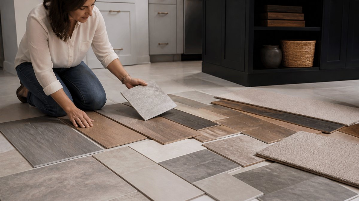
Day 1: Place Samples Request full-size samples (at least 12 inches × 12 inches). Place one in the brightest area (near a window), one in a low-light corner, and one where you spend the most time (near sink or stove).
Day 2: Observe Throughout the Day Observe samples in morning, afternoon, and evening light. Photograph them at each time without flash to see how color shifts, this is what you'll live with.
Day 3: Evaluate With Cabinets and Countertops Place samples next to cabinet and countertop samples. View from across the room. Verify the floor undertone harmonizes with cabinets and countertops, mismatched undertones will never feel cohesive.
Day 4+: Live With Samples Leave samples for at least three more days. Your eye adapts to colors over time. If a color still feels right after four days, it's likely a good choice.
Window Direction and Its Impact
North-facing kitchens receive cool light; warm-toned floors counterbalance this. South-facing kitchens receive warm light; cool or neutral floors prevent excessive warmth. East and west-facing kitchens experience shifting light; neutral or greige tones adapt well.
Should Kitchen Floors Be Lighter or Darker Than Cabinets
Light flooring with dark cabinets creates contrast and opens visual space. Dark flooring with light cabinets grounds the space and adds weight. The key principle is balance: if cabinets are bold, choose a floor that provides relief. Consider countertops too, your floor, cabinets, and counters should work as a trio with mixed tones for visual interest.
How to Match Kitchen Flooring With Cabinets and Countertops
Matching flooring with cabinets and countertops is about understanding undertones and creating intentional contrast or harmony.
Identifying Undertones Across Materials
Every color has undertones, subtle hues beneath the main color. A gray cabinet might lean warm (beige) or cool (blue). Mismatched undertones create visual discord. Matching undertones across cabinets, countertops, and floor creates cohesion.
Examine cabinet and countertop colors in natural light to determine warm or cool undertones. Choose a floor sharing those undertone characteristics. Wood-look flooring's natural variation bridges cabinet and countertop colors by containing multiple tones.
Creating Visual Balance With Contrast
Contrast makes a kitchen feel designed. If cabinets and countertops are similar, your floor should differ noticeably. Dark colors anchor a space; light colors feel airy. A patterned backsplash pairs well with a simpler floor; a plain backsplash allows for textured or patterned flooring.
| Design Element | Visual Effect | Best Paired With |
|---|---|---|
| Light floor with dark cabinets | Opens space, creates contrast | Neutral or light countertops |
| Dark floor with light cabinets | Grounds space, adds sophistication | Medium or warm countertops |
| Wood-look floor with any cabinet | Bridges tones, adds warmth | Cabinets with warm undertones |
| Patterned floor | Creates movement and interest | Solid-color cabinets and counters |
Kitchen Flooring Color Ideas for Different Styles
Your kitchen style should guide your flooring choice. Different design aesthetics call for different floor colors and textures.
Modern kitchens feature light gray, concrete-look, or pale wood. Traditional kitchens use warm wood or terracotta. Transitional kitchens use warm gray or greige. Coastal kitchens use light sand, whitewashed wood, or pale blue-gray. Industrial kitchens use polished concrete, dark gray, or black.
Warm tones and natural textures remain popular choices across all styles. According to Floor Coverings International's 2026 flooring trends report, warm tones and natural textures continue to dominate kitchen design preferences. Patterned flooring is also gaining attention as homeowners seek more visual interest and personality in their spaces.
Textured vs. Smooth Kitchen Flooring
Texture serves two purposes: visual interest and functional safety. Many assume textured surfaces are slip-resistant and smooth surfaces are slippery, this is not always true. Understanding the difference between visual texture and actual slip resistance is critical.
Visual Texture vs. Functional Slip Resistance
Visual texture is how a floor looks (embossed, matte, glossy). Functional slip resistance is grip when wet, measured by coefficient of friction (COF). A smooth floor can have high COF if the material is naturally grippy. A textured floor can have low COF if the texture is purely embossed without actual surface irregularities.
In kitchens, functional slip resistance matters more than visual texture. ANSI and OSHA recommend a minimum COF of 0.60 for frequently wet areas. Most kitchen flooring should meet or exceed 0.60.
How to Assess Slip Resistance Without Relying on Appearance
Ask your retailer for the COF rating of specific products. Perform a wet-surface test: wet the sample and press your hand or shoe against it. Repeat after several minutes, some surfaces become slippery only after prolonged moisture. This tactile test is more reliable than appearance.
For tile, grout lines contribute to slip resistance, but high-gloss tile may not provide enough grip. Choose matte or textured tile finishes. For vinyl, choose products with embossed or textured surfaces that create actual depth. For wood, matte or satin finishes provide better grip than glossy finishes.
Visual Texture: Aesthetics and Maintenance Trade-Offs
Beyond safety, visual texture affects how your floor looks and how much maintenance it requires.
Embossed textures add visual depth and hide scratches better than smooth surfaces. Matte finishes reduce glare and hide dust and water spots better than glossy finishes. Smooth, glossy finishes feel sleek but show every footprint and become slippery when wet.
Texture and Durability in High-Traffic Kitchens
Textured surfaces hide scratches and wear better than smooth surfaces but can trap dirt. Families with young children or pets might prefer textured flooring for hiding daily wear. Those prioritizing easy cleaning might choose smooth flooring and accept visible wear.
Maintenance Differences by Finish Type
Matte finishes require less frequent polishing or resealing than glossy finishes. If you choose a matte wood or engineered wood floor, you may only need to reseal it every 3-5 years. Glossy finishes show wear faster and typically need resealing every 1-2 years.
Textured vinyl and tile are easier to maintain than smooth versions because they do not show water spots or dust. A quick sweep and mop keeps them looking clean. Smooth tile or vinyl requires more frequent cleaning to maintain a polished appearance.
Grout maintenance is significant for tile floors. Textured grout (such as unsanded grout) hides stains better than smooth grout, but it is harder to clean. Sealed grout resists staining but requires periodic resealing. Light-colored grout shows dirt and stains more visibly than dark grout, regardless of texture.
Test Samples in Your Actual Kitchen Space
When learning how to choose kitchen flooring color and texture, never base your decision on a showroom sample alone. Showroom lighting is controlled and bright. Your kitchen has different lighting conditions. Colors shift dramatically between environments.
Request samples from your flooring retailer. Hamptons carpet one floor and Home provides samples so you can evaluate how colors and textures appear in your actual space.
Observe the samples at different times of day. Morning light, afternoon light, and evening light all change how the floor looks. Take photos of the samples in your kitchen. Compare those photos to how the floor looks in person.
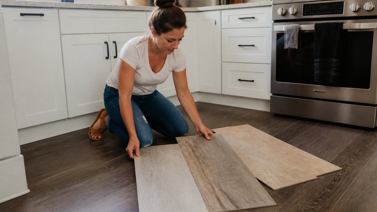
Walk on the samples. Feel the texture under your feet. This tactile experience matters. A texture that looks good might feel uncomfortable to walk on daily. A smooth finish might feel slippery when wet.
Bring samples home for at least three days. Your eye adapts to colors over time. What looks bold on day one often feels normal by day three.
Common Mistakes to Avoid When Choosing Kitchen Flooring
The biggest mistake is choosing flooring based only on color. Texture, durability, and maintenance matter equally. A beautiful floor that requires constant cleaning or shows every footprint becomes frustrating fast.
Another common error is ignoring undertones. A floor that clashes with your cabinet undertones will never feel right, no matter how much you like the color in isolation.
Choosing flooring that's too trendy is risky. Trendy colors feel dated quickly. Neutral, warm tones remain appealing year after year.
Failing to consider slip resistance causes problems in a kitchen. Kitchens are wet environments. A slippery floor is a safety hazard. Choose textured or matte finishes that provide grip, especially in high-traffic areas.
Underestimating the impact of grout color is common with tile flooring. Grout color affects how the overall floor pattern reads. Light grout makes individual tiles stand out. Dark grout creates visual continuity. Choose grout color intentionally.
Overlooking room transitions creates jarring effects. If your kitchen opens to a dining area or living room, your flooring choice affects the entire adjacent space. Coordinate colors across transitions for a cohesive flow.
Choosing the right kitchen flooring color and texture transforms your entire kitchen. The process requires attention to lighting, undertones, durability, and your personal style.
Frequently Asked Questions
Should your kitchen floor be lighter or darker than your cabinets?
The best approach depends on your desired visual effect. Lighter flooring than cabinets creates an open, airy feel and makes small kitchens appear larger. Darker flooring grounds the space and adds drama, especially with light cabinets. Neither is inherently better, choose based on your kitchen's natural light, size, and the mood you want. Test samples in your actual space under different lighting conditions to see which works best for your home.
How do you match kitchen flooring to cabinets and countertops?
Start by identifying the undertones in your cabinets and countertops, warm (golden, honey, red) or cool (gray, blue, ashy). Choose flooring with matching undertones to create cohesion. If your cabinets are warm wood and counters are warm beige, select flooring with warm undertones. You don't need exact color matches; coordinated undertones and a clear visual hierarchy (one dominant color, one or two accents) create balance. Bring samples home and view them in morning, afternoon, and evening light.
What kitchen flooring color ideas work for coastal or high-traffic homes?
For coastal properties and busy households, consider warm mid-tones or neutral grays that hide sand and dirt well. Wood-look vinyl plank or tile with natural color variation masks wear patterns. Matte finishes show fewer footprints than glossy surfaces. Patterned flooring or subtle veining adds visual interest while concealing marks. Avoid very light flooring in high-traffic areas unless you're prepared for frequent cleaning. Ask about slip resistance and water resistance ratings, especially important for coastal environments where moisture and salt air are concerns.
Does textured flooring show less dirt than smooth flooring?
Textured flooring can hide fine dust and dirt better than smooth, glossy surfaces because the texture breaks up light reflection and creates visual variation. However, textured finishes trap debris in crevices, making them harder to clean thoroughly. Embossed or matte textures work best for busy kitchens, they're forgiving visually and easier to maintain than high-gloss smooth finishes. Consider your household's cleaning habits: smooth finishes require more frequent wiping but clean faster, while textured finishes need vacuuming or sweeping to reach grooves but hide everyday mess better between cleanings.